Poster Boy
Poster Art 150 at the London Transport Museum uses the occasion of the 150th anniversary of the tube to showcase some of the stunning imagery associated with the network over the past Century and a half. Communication is the key - posters are used on London transport to help point people in the right direction.
Oh the irony then of Poster Art 150 being hidden away at the back of the Transport Museum, confusing a couple of bleary eyed early morning commuters who instead spent a delightful two hours looking around the rest of the Transport Museum first.
Whoops.
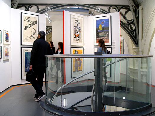
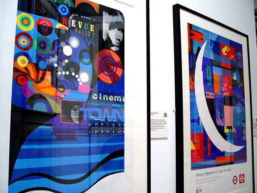
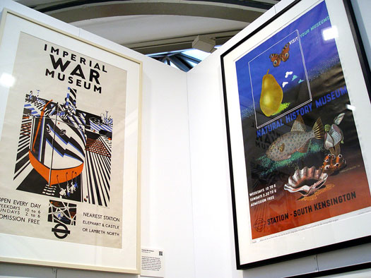
But once you locate Poster Art 150, it is a fantastic array of colour and communication, being both playful and public spirited. Traveling on London Underground over the past 150 years hasn’t always been easy. The posters serve as a rallying call to make the most of the network and the pleasures that you might find at the end of the Northern Line (southbound, natch.)
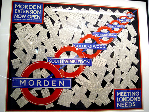
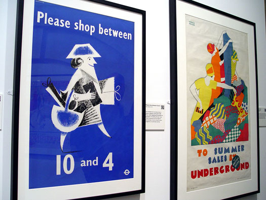
The Transport Museum collection contains 3,300 different posters. Deciding which 150 of these originals to be displayed as part of Poster Art 150 was always going to be a subjective decision.
The curators have got it just about right. There is a relative distribution of branch lines, locations and subject matter. Much of the artwork is themed towards a particular area - safety, sport and engineering works all feature.
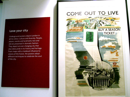
It is a broadly historic approach to the spread of posters throughout the exhibition. What you soon realise is that although there is no pre-defined house style to London Underground posters, a definite tradition has been observed throughout the past 150 years.
To compliment the bright colours is a design ethos of simplicity. Watercolours and pastels aren’t really part of Poster Art 150.
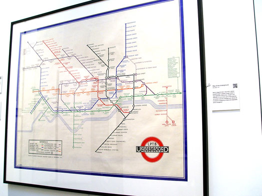
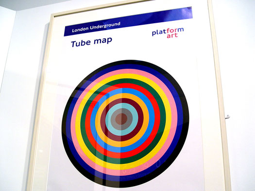
The prolific output of Charles Sharland dominates the pre World War One era. Harry Beck’s original iconic tube map remains a delight to observe in great detail, some eighty years since it first appeared. The bastardised current carnation is still functional, but the simplicity has got lost a little in the way of corporate branding.
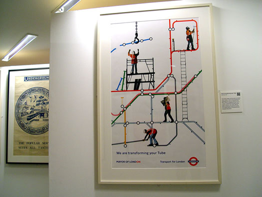
The medium is very much the message as you wander around the exhibition. London Underground posters serve an informative purpose, rather than simply filling the hoardings in-between stations. The misery of the Northern Line at 8am on a Monday morning could be brightened up if the old posters replaced some of the current commercial ‘artistic’ offerings.
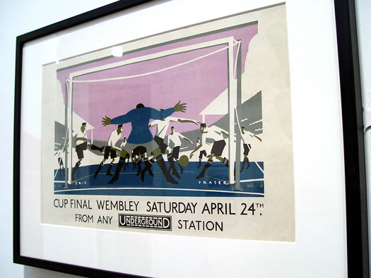
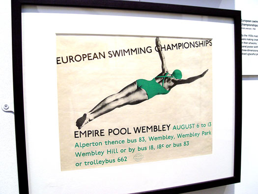
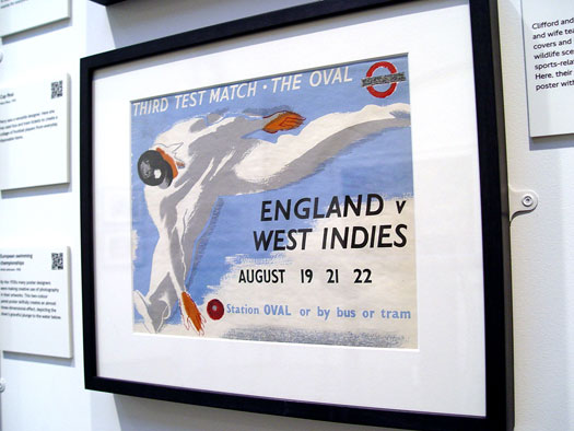
Some personal highlights for me covered sport; the 1928 FA Cup Final, swimming at the Empire Pool in 1938 and The Windies Oval Test Match of 1939. They have a Boy’s Own comic book appearance - modernity and sport captured in a simple poster design.
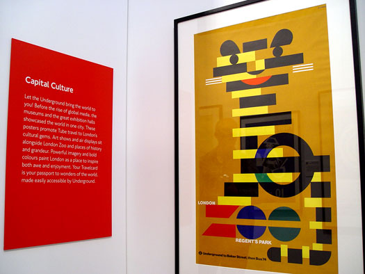
Modernism runs throughout Poster Art 150. The Pop Art style of the late 60′s creeps in with some West End designs, offering a slight play on the theme and a further explosion in colour.
Little is lost as you speed towards the 21st Century. The now iconic colours of each line are captured, making even line closure posters look appealing.
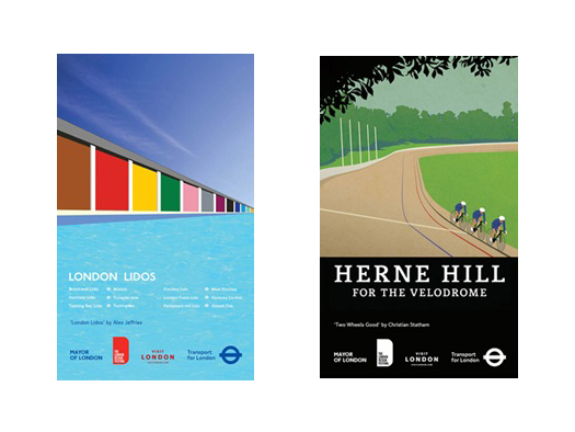
My two personal favourites from the Transport Museum archives don’t appear. No worries - if gives me an excuse to publish Alex Jeffries Lido poster and Chistian Staham’s Herne Hill Velo poster below.
Here be the view from my office wall:
Poster Art 150 continues at the Transport Museum until 23rd October. Adult admission is £15 - which also doubles up as a twelve-month membership for the brilliant Transport Museum.
Return visits improve your sense of direction…


No Comments on "Poster Boy"